How food packaging is designed to make decisions for you - and what to look at instead
I've spent years working as an Art Director and packaging designer. Here's what I know about how labels are designed to influence your choices - and how to see past it.
Your brain makes decisions faster than you think
You spend an average of a few seconds looking at a product before deciding whether to put it in your trolley. Packaging designers know this. In fact, the entire discipline of packaging design is built around this reality - how do you communicate the most persuasive version of a product's story in the time it takes someone to glance at a shelf?
The answer is shortcuts. Visual and verbal cues that trigger an instant emotional or rational response without requiring the shopper to stop and think. Colour, size, font weight, claim placement - every single element on a pack is a deliberate decision designed to move you toward a purchase.
This isn't sinister. It's just design. But when those shortcuts involve health and nutrition claims, it's worth understanding what's actually being communicated - and what isn't.
A real example from the supermarket shelf
I recently picked up two products from the same brand - Jordans granola. One is their regular Crunchy Oat Granola Bursting with Berries. The other is their Low Sugar Granola Almond and Hazelnut.
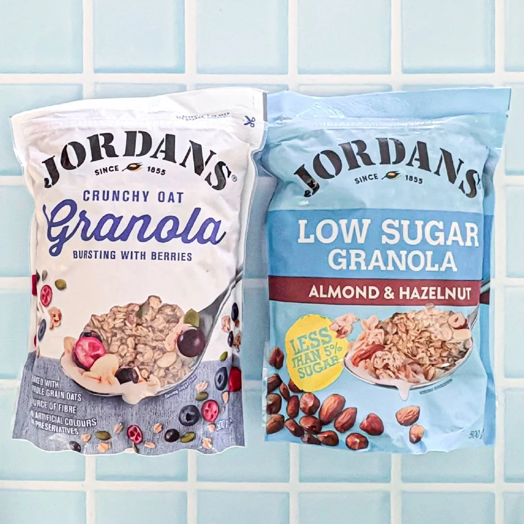
The Low Sugar version has bold, prominent "LOW SUGAR" branding across the front of the pack. There's also a yellow callout badge that says "Less than 5% sugar." It's designed to communicate health. To signal a better choice. And if sugar is your primary concern, it absolutely is the better choice - the claim is completely true.
But here's what the front of pack doesn't tell you.
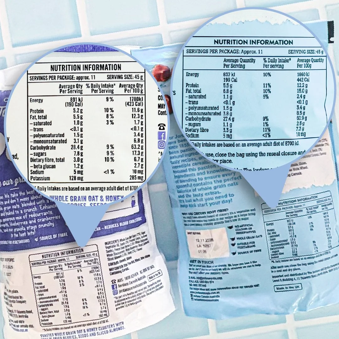
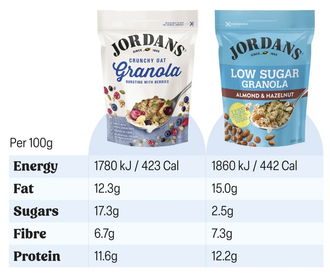
The Low Sugar version has dramatically less sugar - 2.5g vs 17.3g per 100g. That's a real and significant difference. The claim is not misleading.
But the Low Sugar version also has more calories - 442 vs 423 per 100g. And more fat - 15g vs 12.3g per 100g.
Why? Because when you remove sugar from a granola you have to replace it with something to maintain texture, flavour and bulk. In this case that something is nuts - almonds and hazelnuts, which you can see prominently in the ingredients list. Nuts are nutritious and the fat they contain is largely unsaturated which is the good kind. But nuts are also calorie-dense. So the Low Sugar version, while genuinely lower in sugar, ends up being slightly higher in overall calories.
If you picked up the Low Sugar version assuming it was the lower calorie option - and many people would - you'd be wrong. Not because the brand lied, but because the front of pack told you one part of the story and your brain filled in the rest.
This is how packaging design works
As someone who has worked in art direction and packaging design, I want to explain what's actually happening here - because it will change the way you look at every pack you pick up.
When a brand develops a product with a genuine nutritional benefit - lower sugar, higher protein, more fibre, reduced fat - they will always lead with that benefit on pack. It's their hero claim. It's the reason someone should choose their product over a competitor's.
The design is then built around making that claim as prominent, credible and persuasive as possible. Font size, colour contrast, badge shapes, photography - everything serves the hero claim. Everything else, including the information that might complicate the story, lives on the back of pack in the nutrition panel.
This is not deception. Every piece of information you need to make an informed decision is on that pack - it's just not all given equal visual weight. The front of pack is the highlight reel. The nutrition panel is the full story.
The problem is that most people never flip the pack over.
Corn Flakes vs Coco Pops
Here's another one that might surprise you.
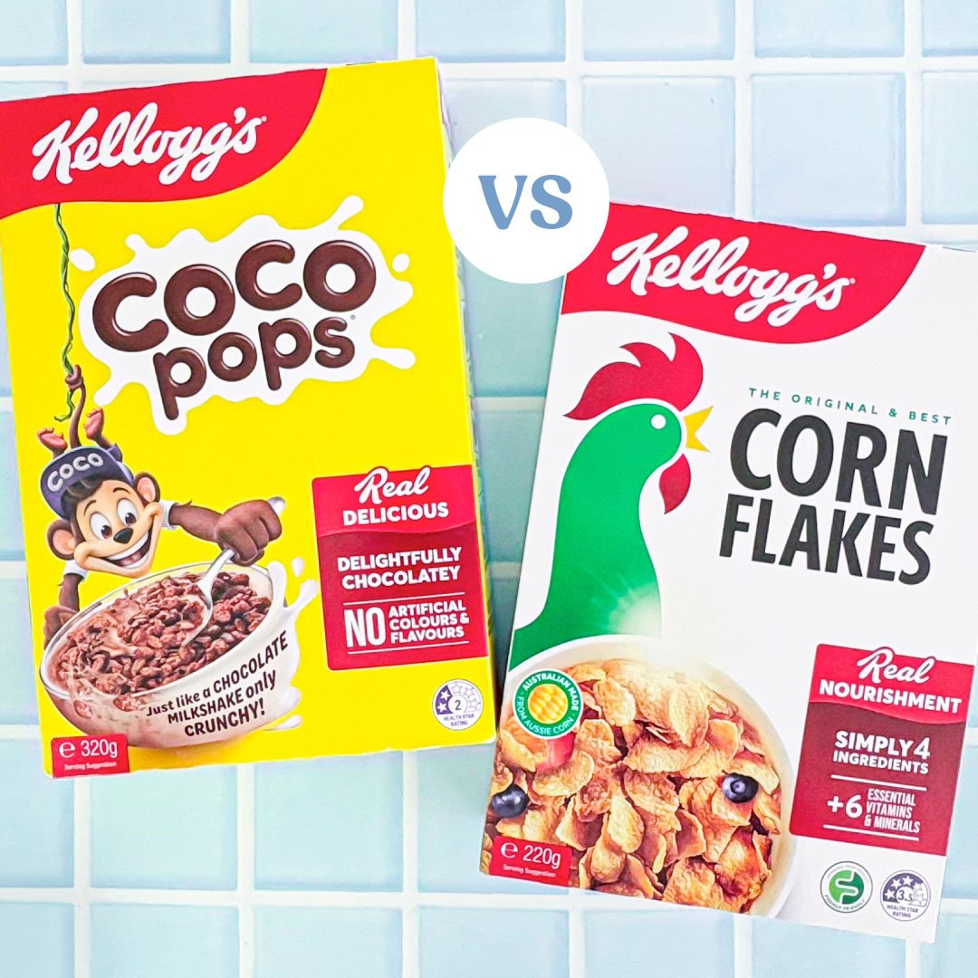
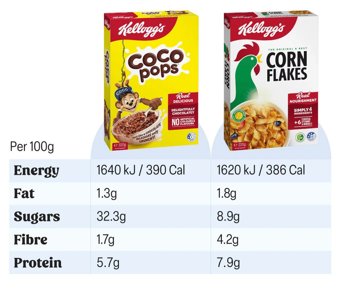
Corn Flakes are widely perceived as the sensible, healthy breakfast choice. Coco Pops are the fun kids' cereal - chocolatey, sweet, obviously a treat.
Per 100g, Corn Flakes comes in at 386 calories and Coco Pops at 390 - a difference of just 4 calories. That's not a typo.
The perception gap between these two products is enormous. The calorie gap is almost zero. Corn Flakes look like a diet food. Coco Pops look like an indulgence. The packaging design, the brand positioning, the colours, the imagery - all of it creates a story that the nutrition panel simply doesn't support.
This doesn't mean Corn Flakes and Coco Pops are nutritionally identical - they're not. Corn Flakes have less sugar. Coco Pops have more. But if you're eating a larger bowl of Corn Flakes because you think they're significantly lower in calories, you might be surprised to find out they're not.
The claims that are regulated vs the ones that aren't
In Australia, FSANZ regulates what nutrition claims can be made on food packaging. Some claims have specific legal definitions:
"Low sugar" - must contain no more than 5g of sugars per 100g for solids
"Low fat" - must contain no more than 3g of fat per 100g for solids
"High protein" - must contain at least 10g of protein per serve and protein must contribute at least 20% of the energy content
"High fibre" - must contain at least 4g of fibre per serve
These are real, defined thresholds. When you see these claims on an Australian product they have to meet specific criteria - they can't just be aspirational marketing language.
But there are plenty of words that sound healthy and have no regulated definition at all:
"Natural" - means nothing specific in Australian food law
"Wholesome" - not defined or regulated
"Goodness" - not defined or regulated
"Clean" - not defined or regulated
"Nourishing" - not defined or regulated
These words create a feeling. They're doing design and marketing work, not nutritional work. A product can call itself "natural wholesome goodness" regardless of what's actually in it.
What to actually look at
None of this means you should distrust food packaging or spend twenty minutes analysing every product in the supermarket. The system generally works - regulated claims are real, nutrition panels are standardised, and most products are exactly what they say they are.
But if you have a specific goal in mind - managing your calorie intake, reducing your sugar consumption, hitting a protein target - here's the most useful habit you can build:
Flip the pack over.
The front of pack tells you what the brand wants you to know. The nutrition panel tells you everything. Specifically:
Use the Per 100g column to compare products fairly - serving sizes vary wildly between products and can make comparisons misleading
Check the number that matters for your goal - if you're managing calories, check energy. If you're reducing sugar, check sugars. If you're increasing protein, check protein. Don't assume that a product optimised for one metric is automatically better across all of them
Read the ingredients list - it tells you why the numbers are what they are. The Low Sugar granola has more calories because it has more nuts. That's right there in the ingredients if you look
Understand that a regulated claim is specific - "low sugar" means low in sugar, not low in calories, not low in fat, not nutritionally superior across the board
The packaging is doing its job. Your job is to look past the highlight reel and read the full story.
The practical takeaway
Food packaging is designed by smart, skilled people whose job is to communicate the most persuasive version of a product's story in a few seconds of your attention. Understanding that isn't cynical - it's just useful.
Regulated claims like "low sugar" and "high protein" are real and meaningful. Unregulated words like "natural" and "wholesome" are vibes, not facts. And no matter what the front of pack says, the nutrition panel on the back always tells the complete picture.
The next time something on a label catches your eye, flip it over. Compare per 100g. Check the number that actually matters for your goal. That's it - that's the whole skill.
Want to know how to read every part of an Australian nutrition label with confidence? We break it all down step by step - using a real Weet-Bix box - in How to actually read an Australian nutrition label.